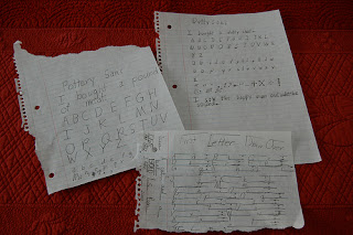
We watched Helvetica on Sunday. Turns out, I knew almost nothing about the font, other than it turns 50 this year, and therefore found the film very interesting. (It’s everywhere! Who knew?) My husband and son joined me about 20 minutes in …. and stayed ’til the end. Starting Monday morning, someone was hard at work developing his own fonts. Pictured above are his first three attempts: Pottery Sans, Dotty Sans, and my favorite, First Letter Draw Over. I love FLDO because of its rules. If the first letter is a capital, the draw over goes on the tops of the letters. If it’s lower case, the draw over becomes an underscore of sorts (really, a draw “under”, but why quibble?) As you can tell, he’s quite the fan of “sans” fonts – says they’re easier to design.
Have a good Wednesday!