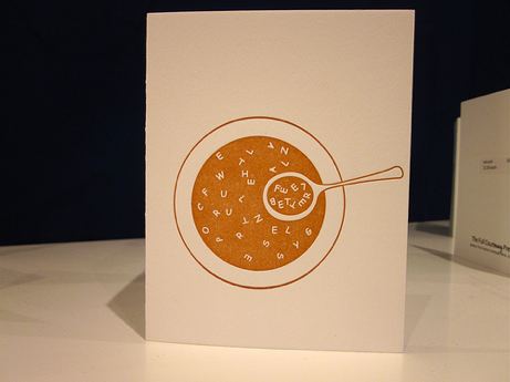
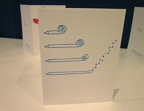
Favorite new line at the show has to be The Full Courtney Press. I am completely smitten with the simplicity + playfulness of designer Courtney Renard’s letterpressed greeting cards. Courtney and her mother were manning the booth on Sunday, full of energy and enthusiasm. Love that! (And not that I wish illness on anyone, but I’d sure like to buy + send the alphabet soup card pictured above. Anyone?) Check out a wider range of Courtney’s work at The Full Courtney Press website.
-
about
simplepretty is a lifestyle blog written by jane potrykus and informed by her travels. topics covered include fashion, design, living, photography, travel, and paper, with a penchant for letterpress. posts are curated to fit a utilitarian luxe® aesthetic.
-
-
Search
-
See Also
-
Archives
-
photo notice
photo credits are important. as such, please contact me to request corrections or removal.


2 Comments
what is it about the alphabet, typography and words that gets us all so excited? What ever it is, I love these designs… so sweet. So clever.
they are practical and meaningful – right up my alley!