
somerset house
I have a confession: I’m not much of a fancy food person. Good food, served simply, goes a long way in my book. That’s probably why I’m so drawn to Fernandez & Wells. Launched in 2007 by Rick Wells and Jorge Fernandez, the mini-chain of London cafés has a guiding principle of serving food suitable for a shepherd’s knapsack. (Think good bread, wine, cheese, cured meats — simple, flavorful foods that travel well.) Couple that mission with Fernandez’s passion for good coffee, throw in some rustic baked goods, and you have a spot that beckons you in, whether you’re in search of morning caffeination, a hearty soup and chunk of bread at lunch time, or a relaxed evening outing of wine and charcuterie.
I’ve been visiting the cafés regularly since my first visit to London five years ago. I’m sure the initial draw was the cozy, minimalist interiors (courtesy of William Tozer Architecture and Design), but during that initial August lunch, my husband proclaimed the chicken sandwich we shared “excellent”, giving instant validation to my design-driven slog through the city. And now, as temporary Londoners, I’ve been able to visit all six locations. My favorite is probably Somerset House because, well, Somerset House! but we finally made it to the original, Lexington Street location just two weeks ago, and spent a leisurely Sunday afternoon sampling wine and grilled pimientos de padrón (peppers). The peppers were outstanding. The interiors were cozily charming. Let’s call it a tie.*

43 lexington street (the very first F&W)
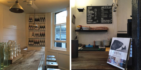
the view from the counter at lexington street

chorizo and heirloom tomatoes (l), grilled pimientos de padrón (r)
And happily, this fall Fernandez & Wells published a cookbook. Rustic tells the story of how the partnership began in 2005, complete with the trials and tribulations in finding the right London location, and yes, plenty of recipes, organized by time of day and beautifully photographed by Helen Cathcart. Rustic‘s tag line is “Simple food and drink, from morning to night” and I don’t think it gets much better than that. I’m sure that, back in the US, cooking from Rustic will be the genesis of many a happy madeleine moment.
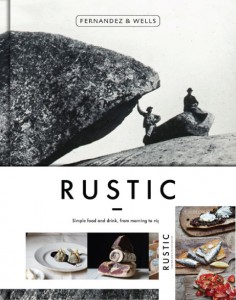
UK (large) and US (inset) book covers
Rustic is available in the UK from Hardie Grant, and in the US — with an alternate cover — via Rizzoli.
* During the all-too-short London summer season, they make an outstanding iced tea.
all images, with exception of book covers, by jane potrykus (cover images from hardiegrant.co.uk and rizzoliusa.com)

office supplies
Thanks to the online rabbit-hole that — circa 2015 — is Instagram: new-to-me stationery brand Kartotek. Based in Copenhagen, the line of winsomely minimalist stationery is sure to be on many a paper lover’s wish list for the holidays. There are notebooks galore in muted colors and graphic patterns, utilitarian-with-a-touch-of-pretty planners and lists, as well as a trio of leaf cards for simple, elegant autumn greetings. I love it all, just clicking through the portfolio brings a sense of calm. Follow them.

leaf greeting cards
images from kartotekcph.dk, layout and type by jane potrykus

Lest there be any remaining doubt, let me affirm once again: I am obsessed with Japanese publishing. On my latest visit to JP Books (to collect the new issue of Cluél magazine), I spotted Coffee Shop and Concept Store Designs: From Interior To Tools (Pie Books, $25) on display behind the registers. The words “coffee” and “design” jumped out at me, and as it was the shop’s only copy, I snapped it up. Impulse purchases and I don’t have a great track record, but not in this case, as Coffee Shop is a delightful compendium of graphic goodness. Divided into two sections — coffee shops and zakka — each shop’s entry combines photos of interiors with supplementary layouts that showcase the branding and identity ephemera along with a simple floor plan. (There are also Q&A’s and a bit of narrative, but as it’s in Japanese, it’s unreadable for me.) The visual stimulation in the form of coffee cups, business cards, menus more than compensates, as it highlights all the items I would save/hoard on a visit to any of these establishments. To that end, the book also works as a de facto travel guide to navigate Tokyo’s coffee scene. (I’m really hoping to schedule a trip to Tokyo soon.)

Marmelo Café and Bakery

close up of Marmelo’s interior

D + E Market (zakka) graphic identity + floorplan

close-up of D+E business cards
If Coffee Shop and Concept Store Designs appeals, you’ll want to check out Small Shop Graphics and Paris: Beautiful Designs on the Street Corner, too. I think I’m heading over to JP Books in search of the Paris volume this afternoon.
photos by jane potrykus

It’s not even Halloween yet, but I’m already sneakily starting to think about Christmas lists, both for giving and receiving. John Derian‘s fall 2015 collection is bursting with decoupage plates and paperweights that show off my favorite subjects (birds, foliage, and constellations) to simple, elegant effect. A few of my favorites are highlighted above — I was elated to see pistacia in the range, as it’s my go-to accent for a bouquet of roses — but check out the full line at John Derian’s website. With so many beautiful choices, I’m tempted to one-stop shop the holidays. (One for you … one for me.)
images from johnderian.com, layout and type by jane potrykus

2016 calendar: hangs with a simple t-pin (there are notecards to match, too)
I’ve been following Sesame Letterpress as long as I’ve been blogging (almost 10 years now!) and their fall 2015 offerings are graphically strong with clever details. A tiny calendar (4.25″ x 5.5″), perfectly simple letterpressed lists, and a cute bat card — who can say no to a cute bat? See all of the offerings (Christmas, too, because it will be here before you know it) at their e-shop.

‘important notes’ set

‘little bat’ hello card
images from sesameletterpress.bigcartel.com
